Hover And Pointer Media Queries in CSS 🔥
As web design and development continue to evolve, so do the ways we interact with websites and applications. One crucial aspect is the use of media queries, which allow developers to adapt their content and styles based on the user’s device or screen size. Among these media queries, “hover” and “pointer” media queries play a significant role in enhancing user experience by tailoring content based on the user’s input method.
Understanding Hover and Pointer Media Queries
The “hover” and “pointer” media queries are CSS features that enable developers to target specific user interactions, namely whether the user’s device supports hovering or has a pointing device like a mouse. These media queries are particularly useful in making websites and web applications more touch-friendly while retaining desktop functionality. They help create responsive designs that adapt seamlessly to various devices, enhancing usability and accessibility.
The Hover Media Query
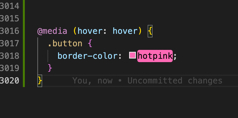
The hover media query allows developers to apply different styles to elements when a user hovers over them. It is particularly valuable for desktop users who navigate through websites using a mouse, as it provides visual feedback and enhances the overall user experience. However, on touch devices, hovering is not possible, making this query less relevant for mobile users.
Example:
Let’s say we have a simple button element that we want to style differently when the user hovers over it:
See the Pen
Untitled by Shaheer (@shaheer-dev1)
on CodePen.
In this example, the button will change its background color to a different shade of red when a user hovers over it, but only on devices that support hovering.
The Pointer Media Query
The pointer media query allows developers to target devices based on their primary pointing mechanism, such as whether the device has a fine pointer like a mouse or a coarse pointer like a finger on a touch screen. This media query helps provide distinct styles optimized for the type of pointer used, improving the user experience on different devices.
Example:
Suppose we have a navigation menu with links and want to adjust the padding for touch devices to make them easier to tap:
See the Pen
Hover And Pointer Media Queries Example by Shaheer (@shaheer-dev1)
on CodePen.
In this example, the padding around the links will be different based on the type of pointer device detected.
Browser Support
While hover and pointer media queries are essential tools for responsive design, it’s crucial to consider browser support. Most modern browsers, including Firefox, Chrome, Safari, and Edge, support these media queries. However, always ensure that critical functionality remains intact on browsers that may not support them, providing fallback styles when necessary.
For More Details: Visit caniuse
Conclusion
Hover and pointer media queries offer valuable options for tailoring web content to the user’s input method, providing an improved user experience across various devices. By using these media queries wisely and considering browser support, web developers can create more accessible and responsive designs that cater to both desktop and mobile users effectively. Embracing these CSS features will undoubtedly contribute to the continued evolution of web design and development, making the internet a more user-friendly place for everyone.